Pickled Priest Cover Story #18: 'American Flag Birthday Suit' - Our 26 Favorite Album Covers Ft. Old Glory

We pause to honor America and its rich 250 year history with this quick post of our 26 Favorite Album Covers that include the American flag in one way or another. Not all of these covers are flattering to 'Merica, so consider this less a patriotic homage than a warts-and-all examination of our best and worst qualities. One thing is sure: artists will use the stars and stripes to convey messages of all types. The American flag is a resilient flapping fucker when unfurled. It can take whatever abuse you have to give it and it will still fly proudly at the end of its pole defying all attempts to undermine its representative power. There's no need to make the American flag great again. It always has been great.
PICKLED PRIEST'S TOP 26 ALBUM COVERS FEATURING THE AMERICAN FLAG
26 Deformed Worship | Rasberry Bulbs

We're always suckers for the homemade punk rock look and this minimalist blackpink effort appeals to our core design aesthetic while it also condones a little flag waving in the process. The best of both worlds. The title, Deformed Worship, seems to undermine the jingoistic pomp of the image, however. Perhaps it's commentary on our country's recent lean toward recombining church and state? Most prescient song title from an album released pre-Trump? How about "When a Lie Becomes the Truth"?
25 The No Fun EP | Local H

Could there be a more fitting interpretation of the American flag than this? In a country packed with super-sized, buffet-grazing fat fucks, Zion, Illinois' Local H packaged their 2003 EP like a product fit to be consumed. With simple color blocking visual and a giant bar-code included for easy scanning, the image is 100% FDA approved decadence. Who knew you could feel patriotic while wrapping your cocktail weenies in bacon for maximum heart stoppage power? Yay, America! You never let us down.
24 American Pie | Don McLean

Donnie Mac stuck his thumb in the proverbial American Pie just like Jack Horner and it came out resembling a bulbous flag, albeit in miniature. No, it's technically not a flag, but it's close enough. He's giving a thumbs up to America in general, or whatever was left of it, and an indelible cover was born.
23 Filth Pig | Ministry

The album doesn't have to be good, just the image. Which is good news for Ministry's Filth Pig. This was released in 1996, but somehow it seems even more relevant now, doesn't it? This is the past and current state of American politics captured in a crude, unsettling image, complete with "Don't Blame Me" button right under the obligatory flag pin on the lapel. No wonder everyone hates politicians who sanctimoniously hide behind the flag when it's convenient. The buck stops with the guy over there.
22 Endgame | Rise Against

I'm strangely captivated by this hazy, filtered, semi-transparent image mainly because it has a distinctly wholesome Midwestern America feel to it, almost like there's some hope and genuine innocence left in our country. I'm so naive. One look at the title, Endgame, and the picture takes on a far more sinister interpretation.
21 Bad Religion | The Empire Strikes First

Since this is a Bad Religion album, I'm going to take this cover to be a statement about the right trying to bring a very specific brand of religion back into our politics. It has overtones of cultish behavior and seems to be telling us to beware of false prophets with empty slogans. The black, white, and red color palette screams DIY punk. Very effective, painfully prescient.
20 Ragged Old Flag | Johnny Cash

America | Johnny Cash

A double-dose of the Man in Black dressed in a blue jean jacket in the former and green army fatigues in the latter. Oh well, it's Johnny Cash—the embodiment of America to many—so we'll allow these two even if neither one is outright great. Johnny pointing to a battle-torn flag is the most effective of the two by far even if the image is a little faded and hazy for my taste. I do get his message loud and clear and that's mostly what matters. On his Bicentennial-celebrating LP, America, John R. looks less like an American icon and more like the leader of a private militia in the remote hills of South Dakota, manifesto in progress, strung out on pills and booze while he ponders his next act of political defiance, Winchester rifle resting on his lap just in case.
19 Norman Fucking Rockwell! | Lana Del Rey

Whose work embodies the purest image of America more than Norman Fucking Rockwell, I ask? Not many, I'd argue. To celebrate the revered Saturday Evening Post icon, LDR poses in front of a background that's painted, not a photograph—especially pronounced in the cloud cover at the top. Nice touch. I almost missed it initially. The rest of the image is so-so, and Lana's pose is pretentious to say the least. At least they have a gorgeous flag mounted on a beautiful wooden mast that kinda looks like an upscale stickball bat.
18 Set 'Em Wild, Set 'Em Free | Akron/Family

From the country that brought you the Grateful Dead comes this partially tie-dyed flag that seems like it has been hastily stitched together from old scraps at a flag factory. This is definitely something you'd see hanging in a bay window on Haight Street in San Francisco. Set against a stark black background, the image really stands out. Another in a series of images on this list that alter the flag without losing its original power.
17 Pink Tape | Lil Uzi Vert

I love the matching jacket/flag combo. This visual demonstrates yet again the versatility of the American flag. The stars and stripes are so iconic by now that deviating the color palette isn't the assault on patriotism some might think it is. Instead, the black, white, and pink palette works pretty convincingly here. I bet General Patton is kicking himself for not trying this out himself. America is the most creative country on the globe and this proves we can push things forward respectfully.
16 Further North | Johnathan Rice

So much for respect, I guess. Using the American flag as a tablecloth ain't smart. Borderline heresy. So why am I still drawn to the image, I ask myself? I'd love to ask its creator, Pierre de Reeder of Rilo Kiley, what his intent was or if he even thought this might ruffle some feathers. I don't think it sold enough for anybody to care. On another note, I'd also like to know why Johnathan (sic) is drinking milk, coffee, orange juice, and wine simultaneously. WTF?
15 American Band | Drive-By Truckers

The darkest night we look upon, they smolder on the lawn
What we smite and bathe in light and where we crawl out from
Draw the blood, accept the stain everyone looks upon
Darkened flags on the cusp of dawn
From "Darkened Flags on the Cusp of Dawn"
A simple photograph can say so much. A boat with the flag at half-mast at twilight. There's a quiet dignity to it and each and every person will understand and interpret it in their own unique way.
14 All-Amerikkkan Bada$$ | Joey Bada$$

A cover that sees the American flag in a totally different way than we've ever seen before—as a piece of intricate bandana art. The flag's instantly identifiable stars and stripes format is mostly what matters here. Some might consider this a sign of disrespect, but to me it seems like a striking reinvention—almost a compliment if you will. Maybe we should adopt this as our "alternate flag" similar to how a Major League baseball teams have alternate jerseys for certain days of the week. This could be our new Friday night flag. Something that makes you do a double-take instead of something you take for granted.
13 Kick Out the Jams | MC5

Those with a revolutionary spirit, like the members of the MC5, are often the ones who hold our country to its highest ideals. They vent their anger and protest, as it their right, calling out our country's leaders when they stray from from their delegated responsibilities. A big part of that is to protect the integrity of the flag for all people, not just those who agree with us. The cover of Kick Out the Jams has the flag all over it, a band trademark, and the kaleidoscopic image fits right in with the band's frenetic onstage energy, for which the band was legendary. One look at this cover and I know one thing: This is a band I want to hear. Even cooler was Wayne Kramer's American flag Stratocaster, as iconic in the guitar world as the flag is in the flag world.

12 Moby Grape | Moby Grape

The photo on the cover of Moby Grape's self-titled debut record was taken by legendary rock photographer Jim Marshall. It looks tame now, but in 1967 the country was living through Vietnam and plenty of social unrest, so the idea of the flag on the same cover as a band member (drummer Don Stevenson) flipping off the camera worried Columbia Records. Their genius decision? Tint the flag Communist red (and blur out the bird) so people wouldn't see it as a political statement of any kind. It turned out to be literally a red flag when they realized the red was an even more dubious decision. Which leads to genius move #2: color the flag black. Looking back at the "controversy" now it seems much ado about nothing. They could've just blurred out the middle finger, kept the flag, and saved a whole lot of time and money. Thankfully, all has now been corrected and the original image is back in all its glory, middle finger and all. It's a cool photo, too, like a bunch of guys showing off their finds from a local antique shop, including a gorgeous old American flag. What's so controversial about saving an unused old flag and putting it back into active service? Nothing.
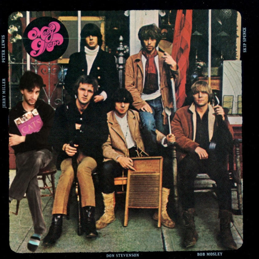
"Commie" red

"Henry Rollins" black
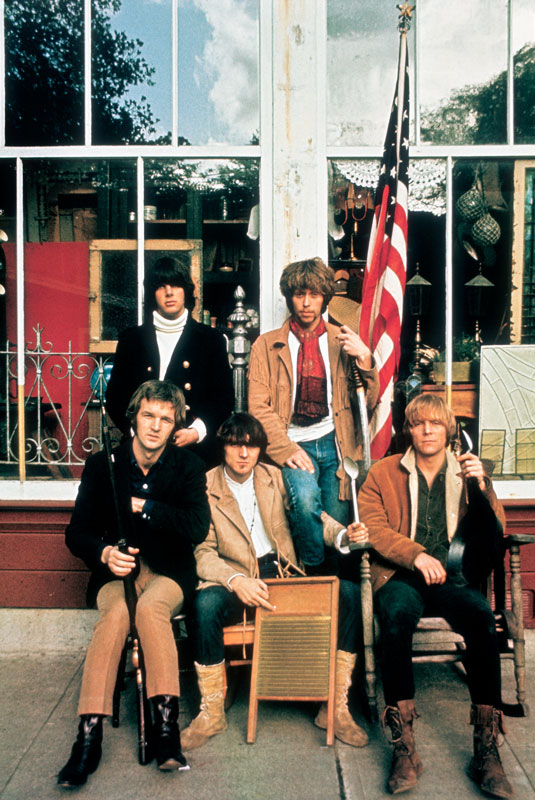
Original photo suitable for framing
11 Triage | David Baerwald

Vastly underrated: David Baerwald's post-David+David solo records. Triage was his second and it featured another cover that could have many meanings depending on how you interpret it. The bloody hands could symbolize our continuing fight to protect America's freedom. Many brave soldiers have spilled their own blood protecting our beloved country. That's downright patriotic. You could, however, view the cover as America having blood on its hands, and it does, via some of its questionable actions over its long history. Either way, it's a striking image, one that makes you pause and think while you listen to a song titled "The Got No Shotgun Hyra Head Octopus Blues."
10 "Around My Way (Freedom Ain't Free)" Single | Lupe Fiasco

OK, it's a single, not an album. I don't care, for this is a strong image in any format. No country will buy and sell you quite like America, so substituting the flag's stripes with a barcode graphic is a poignant reminder of that fact. It's the land of opportunity as they say, which has its winners and losers and, as Bruce Springsteen once sang, "Don't get caught on the wrong side of that line." Some marginalized groups have had it much, much harder than others, of course, which is why rap music's relationship with the American flag is often conflicted.
09 Land Speed Record | Hüsker Dü

It's a big risk to use a photo of the caskets of fallen American soldiers, but that doesn't make this image any less powerful. The band wanted to make an anti-war statement that showed the reality of useless conflicts and there's no denying its massive emotional resonance. Gulp.
08 American Supreme | Suicide

These colors don't run, but they can be manipulated for visual impact. This is a perfect example. I'm not sure if the image is overexposed or a photo negative—how would you describe it?—but taking such an indelible image and bleaching it of its traditional vibrancy is clearly meant to send a stark message. The album was released shortly after 9/11 so perhaps the intended message isn't so elusive after all. It was a major turning point where we all started living in a different, almost dystopian world (at least for a while). Just like a punch in the gut that makes you gasp for air, the U.S. got hit hard, went pale for a while, but soon regained our color and our fighting spirit. Sadly, we didn't know how and where to vent our anger, so we just hit the first guy who looked at us the wrong way.
07 Volunteers | Jefferson Airplane

Photographer Jim Marshall strikes again with this image of the Airplane goofing off after a taping a segment for a Perry Como Christmas special in 1967. How rock and roll! The image isn't the main draw, of course—the flag is, just as it should be. Putting the flag in the background in living, flowing color, really draws the eye. The album title is headline-sized and can mean any number of things both political or charitable, but it is the resplendent flag imagery that stands out most. Everything else is just black and white, secondary figures to the American experience writ large.
06 Skies of America | Ornette Coleman

This powerful cover by artist Michael Gross (not the same one who played the father on Family Ties), whose main claim to fame was designing the Ghostbusters logo (see below), perfectly represents the artist's musical vision. It's truly a work of art worthy of a museum wall. Passers-by should stare at it and ponder its meaning, all the while marveling at its precise execution. It shouldn't be stuck in the back of a crate of seldom-viewed LPs in a used record bin. Surely, it was no easy task to capture everything racing through Coleman's fertile mind when he conceived of the record—song titles indicate, among other things, a struggle with America's treatment of Native Americans. It's a lot to reconcile—hence the visual of "peace" doves ravaging the American flag. That said, the cover also seems to offer hope for what the country could represent when at its best. The line-art background, the fine detail, the doves assuming the colors of the flag, the placement, the composition—all brilliant and thought-provoking. An unsettling yet beautiful album cover and one of the most underrated as well.

05 Stankonia | Outkast

There have been several straight-up "posing in front of a flag" album covers over the years (as you will soon see), but this one is particularly effective. The black and white flag with upside-down stars is clearly a political statement that offers a view of the American identity from an entirely different perspective. Message received. Big Boi and Andre 3000 show their distinct personalities on the cover, seemingly comfortable in their own skin, which is what is most important. The flag is for all Americans, after all. Our diversity makes us stronger. We seem to forget that sometimes (like now).
04 Amorica. | The Black Crowes

Perhaps this should be the new American flag? Why not, really? What do we have to lose at this point? It makes sense that this snipped image from the Bicentennial issue of Hustler magazine be considered for a more prominent role in our deranged, sex-obsessed, scandal-plagued, pussy-grabbing, OnlyFans watching, self-obsessed, social media addicted society. And while we're at it, let's start a GABA movement: Grow America's Bushes Again! Let's bring back the wet and wild days of yore one American flag bikini at a time!

While we're at it: bring back the "Life-Sized Centerfold" as well!
03 Peter Peter Hughes | Half-Staff Blues

When Peter Peter left the pumpkin eating business, he became lead guitarist for the Mountain Goats for twenty years. Now he's left that band and is making his own music. Half-Staff Blues, his first album, lets us know he's a totally different songwriter than John Darnielle (as is everybody to be fair). The title song is about the increased frequency of seeing government flags at half-staff and feeling guilt for not knowing why. I had this happen to me earlier in the year, so I can relate. I asked others and nobody could tell me. I love how this cover eliminates the background, the pole, and any other reference point, but still gets its message across powerfully. Are we overusing it or do we have more reasons to use it than we used to? The answers to both are equally fraught.
02 Born in the U.S.A. | Bruce Springsteen

It’s fitting that Bruce’s massive stadium-sized breakthrough record also has an iconic cover design to go with it. The photo was taken by legendary rock and roll photographer Annie Leibovitz, who had a way of capturing her subjects in unusual ways. And I’ve said it before and I’ll say it again—nobody could photograph a guy’s ass like Annie could. Actually, that’s not really the case, they just took an ass-load of photos during the shoot and as Bruce once joked, “the picture of my ass looked better than the picture of my face, so that’s what went on the cover.” There’s some truth to it when you think about it. Would another photo of Bruce’s face on an album cover have had the same visual impact? I’d argue no. Instead we get a cover that is as American as it gets. Levi's, white work t-shirt, and a red ballcap (no, it's NOT a bandana as some have claimed and it's definitely not a MAGA hat!), with Bruce standing in front of the old stars and stripes (in this case, just the stripes). It’s America in more ways than one, even though the album itself isn’t, as Ronald Reagan might’ve thought, a celebration of American pride. Some also claimed he was pissing on the American flag. Just because he's facing it doesn't mean he's urinating on it. I would speculate that he's pondering its meaning and thinking about what it means to be from the U.S.A. in 1984, a year made famous in George Orwell's book of the same name. The album’s lyrics clearly support this way of thinking. Are we living up to our ideals or are we not? We should always be asking that question and striving for better (especially today). So the answer is always going to be yes and no. And let's hope we're making progress somewhere.

An alternate take to the Born in the U.S.A. concept, this time with Ryan Adams as the focal point. Here, he's the anti-Bruce: facing us in front of an upside-down flag. Somehow the image just doesn't hold the same iconic allure. Maybe seeing Ryan Adams's package, in light of his history of sexual misconduct, is the problem. Nobody deserves to have it foisted upon them without their consent.
01 There's a Riot Goin' On | Sly & the Family Stone

What's goin' on?
-Marvin Gaye
There's a riot goin' on
-Sly Stone
The cover of Sly and the Family Stone's There's a Riot Goin On is both bold and beautiful. It's traditional and brand new. There's no escaping it. The flag isn't off the to the side, in the background, or used as a prop. It's wall-to-wall flag. That it's not the accepted American flag doesn't matter; it's still our flag, just with a little artistic license tossed in for good measure. While the original stars are forever associated with the red and white stripes, this cover replaces those stars with suns. Sun and stripes, forever! It works. Plus, the suns indicate a new day, not a silent night. The sun is an image of vitality and energy. Perhaps we should've gone this route to begin with. With all due respect to all other album covers with an American flag homage, this one just puts it all out out there for all to see in no uncertain terms. This is America, warts and all, so let's celebrate it, baby!
CAUTION FLAGS: THE ONES THAT JUST MISSED THE CUT
Cowboy Carter | Beyoncé

It's very American in many ways, but it's trying way too hard. And it's overly posed.
A New Kind of Army | Anti-Flag

Decent idea, fitting for the band name, but I just can't get behind the graphic for some reason.
Future Blues | Canned Heat

The Iwo Jima concept is a bit passe at this point. It is somewhat humorous, but the joke is stale.
Revival | Eminem

Eminem holding his head behind a semi-transparent flag seems a bit overwrought at this point.
Become the Media | Jello Biafra

Great idea, but the execution is a bit sanitary.
Long.Live.A$AP | A$AP Rocky

A good image, but wrapping oneself in the flag is all too common these days. We're tired of it.
Mourning in America and Dreaming in Color | Brother Ali

I generally like anything that will get under people's skin and this most certainly qualifies, but the overall composition doesn't work for me. Particularly the lettering.
Death Certificate | Ice Cube

Excellent cover, but not enough of the flag is showing to qualify. Nice touch with the Uncle Sam toe-tag, though.
______________________________________
Happy Birthday, America. You don't look a day over 249.
The Priest