2025 YEAR IN REVIEW: Our 40 Favorite Album Covers of the Year (and 15 of the Worst)
- Dec 17, 2025
- 24 min read
Updated: Jan 15
Art, like music, is subjective. Which means, of course, that we are going to pick and rank our favorite album covers of 2025 in the space below. Art must be categorized and monetized and awarded. We are Americans after all! Somebody must win and everybody else must lose!

*Yes, this is also an album cover. It is from the unfortunately-named Wevie Stonder and its title, which apparently took eleven years to decide upon, is Sure Beats Living. Since it featured our judges on the cover it was disqualified from consideration this year, but obviously it's. a masterpiece in its own right.
PICKLED PRIEST'S 40 FAVORITE ALBUM COVERS OF 2025
40
LAVENDER JETS
"Junk Room Melodies"

Why We Like It
The title "Junk Room Melodies" brings the music of Tom Waits immediately to mind, not a band from Cleveland named Lavender Jets, no slight to the LJs at all. The photo has the feel of an antiquity due to the filter used, but close inspection reveals some clues indicating a more recent origin (sneakers a dead giveaway). The cluttered atmosphere gives off an 'anything goes' vibe, like true inspiration could strike at any minute when something new to bang on is found underneath a pile of random crap. Given the choice between a pristine studio recording or junk room masterpiece, I'll take the latter any day.
Photo credit to Cleveland photographer/artist David MacCluskie.
______________________
39
EEL MEN
Stop It! Do Something.

Why We Like It
I've never been a huge fan of bottlecap art, but this cover takes it to the next level. Each cap is slightly different from all the others. Which means the artist had to come up with 49 design variations to pull it off. We appreciate the effort required to do so. A fun game is to spot the subtle differences between caps that appear to be similar. I do love an interactive cover, one that can casually amuse you while you listen to the album. Multitaskers take note.
______________________
38
NICK FRATER
"Oh Contraire!"

Why We Like It
Art Director/Illustrator Adam Mallett has some pretty cool credits to his name (see below for a few more) and this bold album cover design for singer/songwriter Nick Frater of Croydon, UK, is one of his best. On the cover and in the insert there's a game of "Where's Nick?" that has a whiff of a "Where's Waldo?" vibe to it, but with eye-catching road map visuals to assist with your search. It gives me a pang of sentimentality for the days when my family used to pack up the car and head out with just the map in our glove box to guide us. An album cover that transports you to your past. I like that idea.


______________________
37
THE FADEAWAYS
The Fadeaways

Why We Like It
When does a basic, 60's-influenced band photo work as an album cover, you ask? Answer: When the band looks like this awkward garage band from Tokyo, now twenty years deep into a career dedicated to producing psych-rock nuggets for their rabid Japanese cult audience (where there is quite a market for this type of music). You've got to love a band that sticks to a visual gimmick, ala the White Stripes, and the Fadeaways striped shirts (sometimes black, sometimes red) have been along for the entire ride based on some surface research of their back catalog. I can't help but wonder who cuts their hair, but I imagine we'll never find a barber in all of Japan willing to claim responsibility for these dubious dos. In a way, it makes them even more charming in a Teengenerate (Japanese garage-punk legends) kind of way. The rest of the cover is a straight 60's throwback, including 'Stereo' clarification, track listing, and "File Under' recommendation, executed in pleasing black and white, which fits the band's aesthetic perfectly. That said, I would've been tempted to keep the whole thing black and white except for their red-striped shirts to really accentuate their brand.
______________________
36
THE HALF NAKED SHRUNKEN HEADS
Let's Build a Boy

Why We Like It
Copious amounts of highlighter yellow is not normally the ticket onto our year-end album cover list, but this proves that anything can work with proper execution. If you have a semi-ridiculous name like the Half Naked Shrunken Heads (aren't all heads of any size completely naked?) you need to broadcast it in bold letters front and center. Any curious person will want to know what a band with that name sounds like. The title of this Indonesian post-punk band's debut EP is also intriguing, kind of a Weird Science for girls, if you will. The title track is about a girl building a boy to her specifications (goes shopping, cuddles, hates cars, doesn't kick a ball or hit girls, etc.). The red-tinted photo only reinforces that body parts and personality qualities are being assembled and pieced together one-by-one. It's so DIY, as it should be for a young scrappy band like this. The perfect low-budget opening statement.
______________________
35
THE HAHAS AND THE BLABLAS
The Hahas and the Blablas

Why We Like It
Unflattering depictions of four naked band members with no genitals in sight. What discretion. This is what a cover by a band named The Hahas and the Blablas should look like. Never let it be said that Croatia has no sense of humor.
______________________
34
PHILL MOST CHILL / DJAR ONE
Deal With It

Why We Like It
I've commented on this album cover before in my initial write-up earlier this year and again in my Top 50 list, but for those who don't recall, this is an homage to one of my favorite albums, the Otis Redding and Carla Thomas duet record, King and Queen (see below). I credit this cover for me finding one of my favorite records this year—one I likely wouldn't have listened to otherwise—and converting non-listeners to listeners is one of the main jobs of the album cover. So mission accomplished.
Design Note: To make the homage complete, I would've added the initials seen on the Otis/Carla original. Why leave that out? That said, I do appreciate the label logo rendered in the same style as the Stax logo in the lower left corner.

______________________
33
ANNAHSTASIA
Tether

Why We Like It
Sometimes a great album cover can tell you everything you need to know about the artist's musical intent. Annahstasia's Tether, one of our favorite 25 records of this year, is raw, beautiful, stripped-down, intense, intriguing, powerful, textured, rich, purposeful, and a host of other descriptive adjectives. In other words, this cover set to music. Stare at it for a while. She's looking straight at you—or through you—possibly both.
______________________
32
THE HIVES
The Hives Forever Forever the Hives

Why We Like It
The Hives can get away with just about anything in my world. In a time when "No Kings" demonstrations are being held countrywide, the Hives make an album where they're all kings. Genius! And maybe that's the answer, even if it is couched in the band's trademarked humor. Let's all be kings or queens! If we all are then nobody is.
______________________
31
DEAD PIONEERS
Po$t American

Why We Like It
It's payback time. As you might've discerned already, Native American punk band Dead Pioneers do not hold back their feelings or mince words. That provocative and powerful message extends to their album art. And let's put it this way; it's as charged as the music they play, and vividly reminds red, white, and blue bleeding Americans of the cold, hard facts behind their origin story. Striking. Literally striking.
______________________
30
LORDE
Virgin

Why We Like It
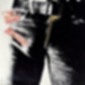
The cover for Lorde's Virgin album could've taken many forms. The word "virgin" has different connotations for different people (just ask Madonna). Lorde has called this cover the "ultimate nude" and she's right. Mainly because it's not a nude, but a transparent look beyond skin deep, right through her belted blue jeans, complete with metal button and rivets. The presence of an IUD takes the title to another level, of course, and the reasons are obvious. It also clarifies that this is not the x-ray version of the Stones' Sticky Fingers cover (see below). What it is, is a cover that conveys a message to the listener. Lorde is about to show you in her music parts of her we may not have seen before. A perfect example of a visual complementing the artist's vision.
______________________
29
THE K'S
Pretty on the Internet

Why We Like It
Hot pink will always get its share of attention. That's why it was invented. And in an attention-craving world you've got to use everything at your disposal to get one more follower, one more like, one more anonymous affirmation. It also helps to be attractive. I can't see you, but I assume you're shocked by this news. An album cover doesn't need to be anything but effective—fine art is always welcome, but not required; graphic design brilliance is appreciated, but won't always get you noticed. This may aggravate industry professionals, but the combination of color, title, and graphics may be entry-level, but they work together to convey a powerful and disturbing message.
______________________
28
BUTTHOLE SURFERS
Live at the Leather Fly

Why We Like It
I immediately Googled the Leather Fly and was disappointed to find out it is a fictional club conjured from the demented imagination of Gibby Haynes, legendary frontman of Butthole Surfers. I guess I shouldn't have been surprised—what else should I expect, something straightforward? I just love this leather fly's fly leather getup. If all flies looked this hip, maybe they'd be more tolerable to humanity. I must say I was a little unnerved to hear this cover was created by Butthole guitarist Paul Leary using AI. I believe this is the first AI cover ever to grace our year-end album covers list. At first, I wanted to exclude it on principle, but then what other past innovations would I have needed to cut? Computer-generated art? Photoshopped art? Airbrushed art? The rubber stamp? In the end, you still have to come up with a visual that works and that in itself is an art. For those reasons, it stays.
______________________
27
METRONOMY
Greatest Hits

Why We Like It
First off, I love that Metronomy has put out a Greatest Hits, a dying art that I really miss. It's irrelevant to me that they haven't actually had any hits; just the idea of it is welcome. It's a bonus that they took the time to put their best work together (seven albums to choose from) in such an attractive package, too. My eyes were immediately drawn to the colorful letter salad, presented on a slant to keep things a little off-kilter, which matches their musical approach. The band name is clearly discernible in white down the middle, but I also like that they added a simple font clarification at the top. Nice touch. This is a record that would stand out on a busy record shelf, for sure. Bring back the well-thought-out compilation album!
______________________
26
AARON PARKS
"By All Means"

Why We Like It
The legendary design team at Blue Note in the 1960s were punctuation whores. Above all, they loved the exclamation point (two examples below, one with an almost sarcastic number). Although a modern affair, Aaron Parks' third Blue Note release is an obvious homage to the Reid Miles covers that put Blue Note on the map visually as well as musically back in the label's glory years (based on their output lately, this may be another glory period right now). A little less subtlety this time with a massive font size driving home the accommodating title, but nonetheless a welcome reminder of Blue Note's epic run back in the day.


_____________________
25
DEMONIC DEATH JUDGE
Absolutely Launched

Why We Like It
I've said it before and I'll say it again: every Olympic sport would be more interesting with a gun incorporated into it somehow (similar to the biathlon). Ski jumping? That would be amazing. Speed skating? For sure. Gymnastics? Endless possibilities, either on the beam or right after any dismount. Synchronized anything? Guns are the only way to justify this inane trend plaguing Olympic sports. And it goes without saying, that surfing could get in on the action, too. Talk about your mixed disciplines. Finland's Demonic Death Judge have taken this concept to its ultimate degree for the cover of Absolutely Launched, incorporating a longneck rifle into the competition, which even I hadn't thought of to be honest. I was thinking waterproof holster/pistol combo, but this is even better. Do they even surf in Finland? Do they have a surf-shooting team already in place? Are they looking for their own massive upset in 2026? The Miracle on Waves? Fuck, that sounds awesome.
______________________
24
BALEINE
II

Why We Like It
Not the Hootie and the Blowfish reunion album you've been dreaming about. Instead, the second LP from Paris, France post-punk band, Baleine (French for whale). Incongruities abound here. The image doesn't scream post-punk—or whale, for that matter—at all. The beach locale, the nose-laser surfer, and the floating blowfish sporting thick black sunglasses don't either, but I don't give one hootie about all of that. I'm amused by the image and my son said it was his favorite of my 40 selections and sometimes that's all that's required.
______________________
23
LATE ASTER
City Livin'

Why We Like It
After some contentious back and forth, here's the final architect's rendering of the new Pickled Priest campus. To defray the exorbitant cost of the giant, functional cassette player (with equalizer) we allowed San Francisco ambient jazztronica outfit Late Aster to lease the image for the cover of their new album, City Livin'. Major projects don't pay for themselves, you know.
Design note: Architect Mike Brady retained to oversee the project.
______________________
22
DEMSKY
Jugaad

Why We Like It
"It’s about rethinking what music can be when convention is set aside and creativity leads the way."
—Press kit description of album
If that's what this Toronto-based sound artist is all about, and I have yet to confirm it personally, at the very least their album art captures the essence of that ambitious mission statement. If I didn't know better, I might think this is a Norwegian board game or old-time electronics kit from the 1950s. The illustrator responsible is Hagen Schönfeld, possessor of a delightfully peculiar perspective, who is also no stranger to working with bands. One of the great things about this album art list is the discovery of cool new artists. And this is one of them. A few other examples from his amusing brain included below.


______________________
21
SHOPFIRES
We Are Not There But We Are Here

Why We Like It
Shopfires specialize in a low-key brand of jangle-pop set in and around their home of Leicester, England. Their album covers all include older photographs of people and places—nothing spectacular really—but you just know there's a story behind each one. On this year's model, We Are Not There But We Are Here, we find a relatively simple portrait of a cute young girl who seems both bright-eyed and tight-lipped at the same time—an endearing combination of excitement and shyness likely the result of being professionally photographed. Not an everyday occurrence, surely. This band celebrates these moments, so the cover seems a perfect reflection of their aesthetic.
______________________
20
MAVIS STAPLES
Sad and Beautiful World

Why We Like It
Mavis Staples at her kitchen table, seemingly contemplating the state of the world and/or praying for it. She's been doing that for more than a half century, so why stop now? There's such a quiet dignity to this photo. She's got nothing left to prove, but she's got a lot more to give. I don't see her ever pulling back from her life's mission to spread love and hope. This is a cover where you wish you could walk into it and sit down for a while. What would you ask her if you had the chance?
______________________
19
OPEN MIKE EAGLE
Neighborhood Gods Unlimited

Why We Like It
Why stop at Radiohead when you can have a full stereo system for your head, complete with receiver, equalizer, CD player, and dual cassette drives? From the minimalist mind of designer Marcus Wallinder comes this pleasing black & white image on a textured light-grey background. It seems the perfect fit for the artist known as Open Mike Eagle. His hands are open and he's soaring into space, all on the wings of his own music, I assume. Wallinder is a natural album cover artist. His works translate effortlessly to this medium, where simple and memorable is often the best way to go. A few more of his works are shown below; each would make for a great album cover.


______________________
18
GHOSTWOMAN
Welcome to the Civilized World

Why We Like It
This release from Canada/Belgium combo Ghostwoman has a familiar look to it—reminiscent of albums put out by Sacred Bones Records—and that isn't a bad thing in this case. In fact, it matches the retro feel of this cover. I do like a record cover that includes the songs on the front side—a box of pertinent information for easy navigation. I suppose I can forgive the ®️ after the band name, which is a bit much, in exchange for the photo of the couple in the cool white convertible. The perspective of the shot is what sold me, with the female staring directly into the camera above, almost with concern for the safety of the photographer. One hard break and he's roadkill.
______________________
17
ART D'ECCO
Serene Demon

Why We Like It
I do love a cover that looks like an old-time movie still and this one has so much intrigue packed into one shot, you could almost build a script around it. And the title of that script, Serene Demon, is a film I would see any day, any time, as long as it retains the mystique conveyed here. The photo captures the titular demon in all his serene glory. The window slats allow just enough light in to highlight our cold, calculating yet debonair villain, of course using a cigarette holder to augment his polka dotted cravat, ready to order an execution or some other sinister deed.
Photo credit to fellow Canuck, Mike Pepperdine.
______________________
16
AMUSEMENT
First Three EPs Collection

Why We Like It
I like a punk band with a design aesthetic (term applied loosely) and Portland's Amusement, based on their discography, seem put in a little extra effort to ensure a cool visual accompanies their music. If you subscribe to Maximum Rocknroll you've likely seen the work of punk legend Welly Artcore before, a guy who has designed countless albums and singles over the years, mostly for bands I've never heard of and never will. This is one of them. I love the action shot of the band, all members in frame, set in a pleasing turquoise tint, a counterintuitive choice for a punk record, which only makes it stand out all the more. The added bonus of the sharp, red & white logo graphic with extended letters that flow right off the page tops it off, the main indicator that this isn't just your average DIY basement production. This may be the worst thing to say to a punk band, but it looks like they've got their shit together.
______________________
15
LUKE BELL
The King is Back

Why We Like It
It's just a cowboy on a horse set against a partly cloudy sky—the subject of countless gas station watercolors—yet I was immediately drawn to this cover, and had to own it, despite not hearing a word of the actual music. Sanity did eventually win out, and I sampled a few tracks first, but my initial gut reaction was right on the money. I fell in love with Luke Bell's music, too, eventually ranking the record at #13 on my Top 50 list this year. Since that first exposure, and again right now, I've spent some time wondering why it attracted me in the first place and I'm not sure I have a definitive answer. Is it the horse? Partially, for sure, a gorgeous steed, one that's impatiently staring down the camera with a look that says, "Of course it's me, you jackass!" Or could it be the joy on Luke's face? He's clearly in his element and his spirit radiates from the frame. On a lesser note, I appreciate the understated name and titling font. I love the rounded letters with the just the right amount of filigree added. Same for the light border accents and barely visible mountains on the horizon. Then it hit me. It's the whole package working together seamlessly to create an iconic image that, for better or worse, screams America. It also, conveniently, defines classic country music in a single moment. The American cowboy and his horse—America's original team.
______________________
14
RIAN TREANOR & CARA TOLMIE
Body Lapse

Why We Like It
It appears to be raining pink letters and it's Cara's job to catch them all and put them in order. Meanwhile, Rian sits there on his ass doing who knows what. She's clearly overmatched, with several letters about to fall to the ground. How is this an equal collaboration? Despite this, it's still a simple but effective visual. To find out the album title, just read left to right. Good use of white space, pink letters add just a hint of color to a black & white image, and there's a sense of low-grade whimsicality to it that I quite like.
______________________
13
AM I IN TROUBLE?
Spectrum

Why We Like It
In need of some bold colors to mix up the palette, I bring in Brooklyn's Am I In Trouble? to address the issue. How economical—a spectrum. Let's get all our colors in one go! So, we end up with a bit of a Dark Side of the Moon on steroids, this, with their spectrum yielding some non-traditional colors and wavelengths. I was expecting something electronic or ambient from the music, but when I discovered black metal was the genre, I was a bit surprised yet equally delighted by the change of pace. No darkness, monsters, demons, or jagged fonts here. Kudos to Negative Wingspan Records for their black pumpkin logo, too. I like it. The Am I In Trouble? logo (located on the white wavelength) is trying too hard, however. Good thing it's downplayed.
______________________
12
STEREOLAB
Instant Holograms on Metal Film

Why We Like It
The name Stereolab was sourced from a 1950's hi-fi sound effects laboratory, which only makes this cover (and several others from their discography) look like the final report of some sound experiment conducted back in the day. The title seems completely viable, the product of an audio room filled with white-coated nerds who exchange their weekends for amusing blips and bloops from a makeshift device of their own creation. The colors, shapes, and design are all period perfect. If you didn't know better you might expect to find this manual in the back room of an abandoned Radio Shack somewhere.
______________________
11
CHARLOTTE REINHARDT
Fables


Why We Like It
The original (tan) was December 2024, the deluxe version (blueish purple) September 2025. Both have unique characteristics all their own. One more earthy, one ethereal. Both convey the dreamlike magic that comes from her fingers when she sits at the piano. The cover image might express what she sees or feels as she's playing, or perhaps what the listener might feel as the music unfolds. No matter, both will find themselves in another world when the music starts.
______________________
10
ROSALÍA
Lux

Why We Like It
Rosalia's Lux had a major impact on 2025, that is impossible to deny. It was among the most ambitious projects of the year and it begged for an iconic album cover to go with it. Photographer Noah Dillon came through with the shot of a lifetime; part Madonna, part Flying Nun, part Virgin Mary, an image that matches and reinforces the dramatic music contained within. The simple title spread across the middle was inspired, letting the photo do all the heavy lifting. An absolutely beautiful image. If we could just get rid of that godforsaken Parental Advisory Explicit Content warning. An atrocity and an unneeded distraction.
______________________
09
NERVOUS TWITCH
The Day Job Gets in the Way

Why We Like It
Without even hearing it I knew this was a New Wave record. This is how they look and feel and sure enough this Leeds band falls right in line with expectations. I do love the overall theme of balancing passions and day jobs (I live it), but the music is secondary on this list. Pink is a primary color in New Wave, so the soft hue used here neatly allows the spraypainted cardboard letters to stand out as they should. It may be a nostalgia play, but the band pulls it off anyway. I also like the name of the album taped to the bottom like they got it from a game of Ransom Notes or something. A minimalist approach with a side of resourcefulness. The quintessential Hobby Lobby project.
______________________
08
PRESERVATION & GABE 'NANDEZ
Sortilége

Why We Like It
A haunting, Pharoah Sanders circa Thembi vibe is at play here as a blurred sorcerer mixes up his medicine in order to cast a spell or curse depending on the situation. It also looks like a TV on the fritz, frozen and pixelated with a total loss of tracking stability. The beauty of it is that it looks about to correct itself, but never will. Credit Ambroise Bellec, a French artist and graphic designer for the image, which appears to be his first album cover. He nailed it right out of the gate.
______________________
07
PETER PETER HUGHES
Half-Staff Blues

Why We Like It
When Peter Peter left the pumpkin eating business, he became lead guitarist for the Mountain Goats for twenty years. Now he's left that band and is making his own music. Half-Staff Blues, his first album, lets us know he's a totally different songwriter than John Darnielle (as is everbody to be fair). The title song is about the increased frequency of seeing government flags at half-staff and feeling guilt for not knowing why. I had this happen to me earlier in the year, so I can relate. I asked others and nobody could tell me. I love how this cover eliminates the background, the pole, and any other reference point, but still gets its message across powerfully. Are we overusing it or do we have more reasons to use it than we used to? The answers to both are equally fraught.
______________________
06
APOLLO BROWN & BRONZE NAZARETH
Funeral for a Dream

Why We Like It
Sadly, a cover with numerous interpretations and applications. There's really no need for any graphics. That would interfere with the image. The overwhelming heaviness of the scene is reflected in the thick brushstrokes of visual artist, KipDaFog. The richness of the colors, mostly variations on browns and blacks, lends the painting a somber mood. The faces of the pallbearers are incomplete, the mourners silhouettes under their umbrellas, the rain just another indignity to get through. The album title takes the image even further. This isn't a funeral for a single person. It's something much larger than that.
______________________
05
SUNNY WAR
Armageddon in a Summer Dress

Why We Like It
A pretty straightforward message. Sunny War sees herself as the black swan, a perennial outsider in a white-dominated world. But she's not allowing that to stop her. She's Armageddon in a Summer Dress. She's going to make her mark one way or another. And she's gonna be wearing Chuck Taylors when she does.
______________________
04
TYLER CHILDERS
Snipe Hunter

Why We Like It
I wrote my "Best Album Covers with Dogs" post about six months too soon, but I can always revise it. When I do, I'll have to include this one. All I know is if I dangled a turkey leg three feet over my dog's head like this, I wouldn't have a hand left in about two seconds. This painting is by the brilliant, and may I say demented, artist Erik Thor Sandberg. Let's put it this way, the cover for Snipe Hunter is easily the most conventional work I've seen from him (see other examples below). On the surface, we see Tyler Childers, the Creator in his study, which is decked out like a Southern mansion. Underneath, listeners might find song references hidden within and if there's one thing I love about album covers it's a reason to stare at them for a long time to uncover their mysteries.


______________________
03
ARRESTED DEVELOPMENT
Adult Contemporary Hip Hop

Why We Like It
I didn't know this before I picked it, but this album and its cover was dedicated to the late Milwaukee hip-hop pioneer Twan Mack, who envisioned a world with endless genres built around a hip-hop core. The band chose artist Maria Pokrovskaya to bring out the key themes on the record—legacy, family, empowerment—and she does so beautifully here. As the girl stands there, she creates a world of her own making, complete with what appears to be Saturn-like rings. Or, more likely, a forcefield to protect her dreams and visions. On a design note, I love that the rather long band name is abbreviated down to AD and the word contemporary is broken down into multiple lines despite having more than enough room to cram it all on one line (and with odd breaking points, too). If you're making your own world, you get to make the rules as well. A pleasingly limited color palette only makes the image that much more artful. I'd hang it on my wall right now.
______________________
02
THE ARMED
The Future Is Here and Everything Needs to Be Destroyed

Why We Like It
I like how the album title claims the future is here, but the image contradicts that assertion. In fact, a scrap collector goes about his business on a bicycle, tying paper and metal down as he goes to maximize his day’s haul. In itself, a fascinating image that’s a testament to what people have had to do to survive in this world. The band name and album title, looking much like a word salad, makes it seem like this fellow is picking up stray words while he’s out making his rounds to make a little extra cash. It’s not hard to figure out the title, but it does make you scan the image while you’re doing so. It’s inarguable that the world could benefit from starting over and learning from its past lessons, but does everything need to be destroyed to do so? The title is a little jarring in its approach and intent. Just like the music the band creates.
______________________
01
JACK HERSCOWITZ / NICK GINSBURG
Lullaby

Why We Like It
I chose this as my favorite album cover of the year under false pretenses. My interpretation of it is pretty much the exact opposite of the artist’s intent, which he explained in an Instagram post I stumbled upon. That artist, Spencer Adams (unknown to me prior), said the cover was inspired by the music, which was “an epic force...being channeled to soothe and provide solace rather to destroy and dominate…the potential malevolence is disarmed as the hands delicately hold light-filled marbles and flowers. More caring and curious than spiteful.” Uh oh. My initial take was a bit different. I thought the cover depicted evil, monstrous, alien demons using the universe as its plaything, stealing its beauty at will and snapping up its planets in its gruesome claws, all for their own momentary amusement before they wreak havoc on an unsuspecting cosmos. I almost wish I hadn’t read the truth. I like my take better. Either way, it’s an expansive image to contemplate, eliciting radically different interpretations depending on your current worldview, level of optimism, or propensity for the dramatic. If a cover of an album can do all that, it deserves the top spot on this list.
Fin
______________________
...And 15 of the Worst
There are a ton of ludicrous album covers out there that we all could've had some real yuks and grins shitting on, many by artists most have never even heard of before. That said, our definition of a Worst Album Cover is when an artist who should know better lets out a real shit sandwich and expects everyone to call it genius. Those are the ones that really deserve our harsh rebuke. Fifteen examples follow.
(In no particular order; they're all in last place)
01
BAD BUNNY
Debí Terar Más Fotos

Why We Dislike It
The past two Bad Bunny album covers get a lot of love from critics, but I'm calling bullshit. They're lazy. If you accidentally took this during your vacation you'd delete it from your phone without a moment's thought.
______________________
02
TATE MCRAE
So Close to What

Why We Dislike It
Is she about to masturbate to herself? That's pretty fucking vain.
______________________
03
CONAN GRAY
Wishbone

Why We Dislike It
I hate musicals and this looks like a Broadway sailor during an insufferable mid-show dance sequence.
______________________
04
TURNSTILE
Never Enough

Why We Dislike It
Leave the double-rainbow blubbering to sappy Hawaiian tourists, you're a rock band for fuck's sake.
______________________
05
SABRINA CARPENTER
Man's Best Friend

Why We Dislike It
At this point, Sabrina has a permanent reservation on this list. Just a couple props away from a Spinal Tap Smell the Glove homage.
______________________
06
JUANA MOLINA
DOGA

Why We Dislike It
When I'm asked which musician I love that has the worst album covers, my answer is always Juana Molina. The weirdness that makes her music so captivating does not translate to her album art. Creepy.
______________________
07
RON SEXSMITH
Hangover Terrace

Why We Dislike It
The album name is an inside joke within the band (Hanover Terrace misread as Hangover Terrace—laughter ensues in the touring van), which is mostly not funny to those who weren't there. The Ron photo in his pajamas looks like a very unhip suburban father trying to look cool when he drops his daughter off at a friend's pool party. Terrible color palette, too. Like a gender reveal party gone very wrong. This entire thing should've been aborted. Except the music. The music was wonderful.
______________________
08
WEDNESDAY
Bleeds

Why We Dislike It
The record is strong, but this drawing doesn't do it justice. One person's trash is another's treasure, so if you like it, I have no problem with you. I hate it. Especially the lettering and placement. It looks like a German children's book from the 1940s and you want no part of that, I assure you.
______________________
09
PERFUME GENIUS
Glory

Why We Dislike It
Just not a fan of overly-posed photographs.
______________________
10
AUSTRA
Chin Up Buttercup

Why We Dislike It
I'm gonna eat a bag of Doritos and then take a sharp-edged dump. As the main load passes through my rectum, snap a photo. That's the cover.
______________________
11
ALEX G
Headlights

Why We Dislike It
I've had enough of all these the supernatural, magical, medieval, what-have-you, television shows. Moratorium, please! This is a pretty shitty drawing/painting too. And the font completely clashes with the image. I'm sure it was intentional, which doesn't make it any better. I'm sure many will love that, but in this instance the incongruity is stupid. Crabass signing off.
______________________
12
THE BUG CLUB
Very Human Features

Why We Dislike It
I normally like this kind of cluttered madness, but not this time. Especially the hairy-nosed crotch serpent in the middle. That's where they lost me.
______________________
13
FATBOI SHARIF & DRIVEBY
Let Me Out

Why We Dislike It
Love the background, like the gimp, like Picasso Boy, really hate bloody Beavis. That's what ruins it for me.
______________________
14
GEESE
Getting Killed

Capturing the zeitgeist allows you to get away with things. Like a wildly overrated record, for one. And two, a pretentious album cover like this, where a long-haired trumpet player joins N.W.A. for an afternoon. Ooh look, he's playing a horn line and popping caps simultaneously. How fucking innovative and edgy!
______________________
15
AYA
Hexed!

The first thing I thought of was the show Fear Factor and that is not a good thing. Yuck. You're supposed to want to look at the cover, right?
______________________
STILL DECIDING...

Funny and hideous at the same time. Perhaps he should've called it The Freeballin' Jeffrey Lewis.
THE PICKLED PRIEST HOMAGE AWARD
CRAIG FINN
Always Been


If anyone deserves to occupy the Randy Newman spot on this LA bridge, it's Craig Finn.
2025 PICKLED PRIEST AWARDS FOR COVER ART INNOVATION
DRAGNET
Dragnet Reigns!

Built-in autograph panel, not just an OBI strip. Good enough for the Priest Prize for Album Art Innovations! Yup, that's all it takes!
KENDRA MORRIS
Next

BRIGHT EYES
Kids Table

Both Kenrda and Bright Eyes realized this game of life, which translates so well to song, can also make for endless hours of family fun, too. Kenra went so far as to include a fold-out board game and, if you ordered early enough, a pair of dice to go along with it. Conor, predictably, takes a more pessimistic approach.
__________________________
Well that about covers it. See you in about a week for our final post of 2025.
Cheers,
The Priest