Cover Story: Pickled Priest Album Art Spotlight / Bruce Springsteen
- Sep 25, 2020
- 22 min read
Updated: Nov 28, 2020
We love album art, so today Pickled Priest is starting a regular series that focuses exclusively on the visual aspect of music. We believe album art to be a crucial component of an artist’s musical story and that it shouldn’t be relegated to an afterthought. When we look at an album cover, we want it to reflect the music included inside and we want it to stir something in us every time we look at it, just as a great painting does when we visit a museum.
With that in mind, every once in a while we’re going to go through an artist’s catalog (studio albums only) and assess how they present their work from a visual perspective. Today we start with Bruce Springsteen’s collected works. The following list assesses and grades all of his studio albums in reverse order of quality.
BRUCE SPRINGSTEEN
THE STUDIO ALBUMS
#20 Lucky Town (1992)
Grade: F
#19 Human Touch (1992)
Grade: F

Not to add insult to injury, but I think we can all agree these two albums are not Bruce’s best work. Even cherry-picked, they would combine into just an average Bruce record. Sure, there are some great songs, but let’s not delude ourselves. Perhaps that’s why his label, Columbia, half-assed the artwork for both covers. Just slap something together! I truly wonder if Bruce even looked at the proposed covers for his undynamic duo before signing off. Lucky Town features one of the skeeziest photos of Bruce ever taken. He looks like he just dropped a fat stack at the Bada Bing! strip joint in South Jersey and then bought some cheap sunglasses at the gift shop on the way out so he could face the daylight. Have you ever had a hangover before you even went to sleep? This is what it looks like.

Human Touch is slightly less offensive than Lucky Town—we get a nice look at Bruce’s new bracelet and that’s about it. I want big letters! Make the fucking letters bigger...and longer...and redder! The photo of Bruce holding his guitar is so passe by now it fails to even register anymore. Plus, the photo is too dark and it’s hard to make out what it is initially. Even so, it looks like a Shutterstock photo at best. I’m pretty sure I could've come up with something substantially better in a couple hours. And I would've done it pro bono, too. The large red elongated font (with black border) looks like a font you’d get complimentary with Windows 3.1. If he didn’t have the biggest budget at Columbia to come up with something better, this might be forgivable. Rule of thumb for designers: if the product isn't good at least dress it up in a pretty
outfit.
#18 The Ghost of Tom Joad (1995)
Grade: D-

I get it. This is not the typical Bruce record—Attention: serious subject matter ahead—so it wouldn’t be appropriate for Bruce to put another photo of himself on the cover (75% of his albums feature his face according to my math) especially because much of the content revolves around the plight of border crossing migrant workers. So it makes sense to use a stark image for the cover that really drives home the powerful issues presented. But why use an image that really doesn’t generate any emotion at all? What’s the point? Instead we have a man with the ridiculously long and oddly uniform torso on the cover (painted by artist Eric Dinyer). It’s hard to even figure out what’s going on, let alone feel anything at all. I have to think there’s a better way to draw a listener into the stories Bruce tells on Tom Joad. Based on a cursory review of Dinyer’s other works online, I found about ten that would have made for a more provocative choice. Exacerbating the issue is a poor choice of font. It would’ve benefited from something less stylized. This is going to be a common theme throughout this list. Someone at Columbia popped for a fancy font package and you better believe they're gonna use it!
#17 Working on a Dream (2009)
Grade: D

This list is agnostic to album quality—art alone is being considered—but I must say this is likely my least favorite Bruce record. In this case, the cover art follows suit. It almost looks like the cover of an aborted children’s book. And the purpose of a children's book is to get the little fuckers to sleep, so I guess it makes sense that Bruce is sleeping on the cover of his own album as well (did he sing himself to sleep perhaps?). I always took “working on a dream” to mean that life was a work in progress so don't quit, but maybe it just means we should take a good long nap and conjure our dreams the easy way. On the other hand, maybe he's looking down in the photo, perhaps admiring the nifty font below. I want to give this design some credit for working in some original colors, but it just looks like a junior associate in the art department got a new filter app and was playing around with the settings. In 2020, you could make this album cover on your iPhone in about three minutes.
#16 Devils & Dust (2005)
Grade: C-

Bruce loves dark covers and that’s fine with me. But does it always have to be the same color palette? Greys and blacks and golds abound on Bruce’s albums. Is this his directive or a lazy designer with dinner plans? This also appears to be the second consecutive album where Bruce could be caught dozing off. Or is he obsessed with Columbia's new font package as well? Again, we have yet another chunky font with textured lettering. The art department at Columbia could be accused of being a one-trick pony if they’re truly responsible (and four people are credited with the album design this time out!). On the whole, however, the overall look is harmless and does fit the more stripped-down nature of the record, but they took the easy way out in almost every respect. What happened to giving each album its own distinct look like in Bruce’s earlier years? Does anyone remember originality?
#15 Magic (2007)
Grade: C

This looks like Bruce is wearing a Bruce Springsteen t-shirt that he designed on Custom Ink. I don't know if that's cute or sad. Bruce is giving us a look that says, "They didn't even center it!" Magic was designed by the same people who did Devils & Dust and it’s basically the same cover with everything reversed. Bruce looking up vs. looking down, light background vs. dark, eyes open vs. eyes closed, name big / title small vs name small / title big, white shirt vs. black shirt. How creative. For an album titled Magic the design possibilities were endless. Instead they just did the Costanza “opposite” approach and called it a day. There's no magic here at all unfortunately.
#14 We Shall Overcome: The Seeger Sessions (2006)
Grade: C

This is what happens when you leave the original proofs too close to the fireplace. Bruce, for the third straight time, taps into the same boring art directors. And guess what color palette they’re using again? Blacks and golds and browns! This time they're slightly hazy and washed out in order to make it look like an old record left in a damp basement for decades. Not a bad idea in theory—I particularly like the idea of making the title into an old whiskey label—but in practice everything here just seems too “worked” to achieve its intended effect. This is an organic record of old folk songs, so leave the Photoshop program behind for once and let the album go au natural. The real cover is on the inside booklet and features the band outside the studio on the front porch (presumably a break in the recording session). It’s simple and conveys a sense of camaraderie like an album of folk songs should have. The picture used on the cover is good, but it’s squeezed out by an overly large logo and the transparent attempts to make something modern look antique. Fire the art department once and for all! This was a unique chance to create something totally different in Bruce’s catalog, just like the music inside. And they missed a golden opportunity by using too much gold yet again!
#13 High Hopes (2014)
Grade: C+

I didn’t rank these intentionally so I could slag on the Columbia art department repeatedly, but the same person who oversaw the last three was involved in this one, too. I’ll admit, this one is a touch better than the others because it at least makes an attempt to do something a little creative visually. Still, it relies on the same default black, grey, and gold color palette (perhaps Bruce likes this look, I don’t know) again and I’m starting to think Columbia over-ordered these colors from their supplier accidentally and have instructed the art department to use them up ASAP or else. This time we get Bruce overexposed in multiple frames and the effect is pretty cool. I like how his guitar conveys motion with light as well. For once, the font is a good choice—out with the thick stylized lettering of albums past and in with something cleaner and simpler (centering the title was a nice choice, too). Still, this has a “been there, done that” feel mainly because that’s exactly what’s happened. I mean it this time, get some new blood into the Springsteen design camp pronto (and while you’re at it, ditch Brendan O’Brien, too!).
#12 Wrecking Ball (2012)
Grade: C+

The art department has now resorted to designing Bruce's album covers on glass shower doors during their afternoon steam it appears. Believe it or not, this is the same art director as on the last four. Bruce is loyal, I’ll give him that. But are they really any good? Perhaps it’s not all their fault, I don’t really know. But are they good at pushing boundaries and trying something new? I really wonder if they present all kinds of great concepts to Bruce and he chooses the least interesting route every time or if this is simply their design aesthetic. Either way, late-period Bruce album design has been an epic failure so far based on this lame portfolio of generic artwork. If you look at his earlier years, you’ll see diversity from one record to the next. Here, there is very little design creativity at work. I suppose some credit should be given since it’s a little different from past records, and I like how Spring is on one line and Steen on the next, but did we need yet another typical photo of Bruce in repose? Does he ever play his guitar? Or doesn't he know how? This doesn’t show much imagination at all. How about a picture of Giants Stadium getting a wrecking ball in the side? Did nobody think of that? C'mon get on the wrecking ball, people!
#11 Letter to You (2020)
Grade: C+

I know it isn’t, but this looks like a Christmas album to me. Bruce’s Christmas Card to You would’ve been a nice holiday gift for his fans. And in line with that theme, it also looks like he’s modeling for the winter Overland catalog. So he can send us some cheer and help us with our shopping, too! Perhaps Bruce can even put some of the clothing on his website. Bruce is wearing a sheepskin-trimmed, Hungarian leather Bomber jacket with detachable hood, available in High Hopes gold and Art Department brown for $999.00. Complement your look and cover your aging neck skin with added Indian sari scarf, recycled and hand-stitched by underpaid artisans, only $89.00 (available as worn by Bruce in Valspar pewter or oxfeather puce). I'd buy something. While I don’t have the album yet, I know this is a Danny Clinch photograph (a longtime Bruce fave) and it’s a gorgeous shot as always (my issues are rarely with the photos, more with the graphic design). I don’t dislike the cover necessarily as it is immediately striking to the eye, but I cannot get away from the seasonal feel of this one. Graphically, the “Bruce Springsteen” script looks pretty similar to what was used on the Greetings album back in '73—which is a nice touch (did they know?). The title looks like it was done by the artist who paints the letters and numbers on Sesame Street and it actually looks pretty cool. It is different than anything he’s ever used in the past which is my litmus test at this point. I also like the (intentional?) link between the postcard format of Greetings and the Letter format of his new record. It’s like he has more to say to us now, some 50 years later.
#10 The Rising (2002)
Grade: C+

This is the eleventh album on this list and we’re still stuck at a C+ level. Not a good sign. This is the album that started it all and by that I mean his affiliation with the artistic team that was responsible for at least five of the last six entries on this list. With The Rising, make that six of the last seven! Yes, you guessed it, here comes another gripe about the color palette, blah blah blah (I’m sick of saying it myself at this point). This is definitely the best of the bunch, which isn’t saying much. I think the vertical title evokes the thin, tall silhouette of one of the World Trade Centers, and since this is Bruce’s 9/11 response record, it makes design sense. As do the block letters which almost give the illusion of fire. Putting Bruce’s name horizontal makes the tower into a cross of sorts, which I can also live with considering the magnitude of the event. I also like the “blurred Bruce” photo. This album wasn’t about him, it was about the people involved in 9/11 (victims, first responders, etc.). It was also an unprecedented and confusing time, so the blurry photo makes sense. Bruce was probably wondering what his place was in all this. While it’s not the powerful visual the moment deserved, it isn’t an abject failure either.
#09 The River (1980)
Grade: B

As we get into the “iconic” Bruce albums, it’s important to remain objective about the cover art. Think less about what the album sounds like and what it means to you personally and focus exclusively on the artistic design, the fonts, the colors, the impact, how it represents the album, and how the entire thing works on a holistic level. If you look at The River, here’s basically what you get: a two-year-old photo by Frank Stefanko, who also did the Darkness on the Edge of Town cover. It’s actually from the same sessions (hence, I docked the grade a half-level). So this isn’t Bruce 1980, it’s Bruce 1978. Not a huge issue, but he does have the same haircut for two straight albums and that’s not how Bruce rolled back in the day—he had an ever-evolving series of looks and tended to alter his fashion sense regularly. Personally I would’ve voted for something more current. That said, it’s a reasonably nice photo. I think I had that very shirt in 1980, perhaps from American Eagle. It would’ve been difficult to find a photo that adequately reflected the sprawling nature of The River—a little of everything the E Street band did well, to paraphrase Bruce—so this is a safe approach. I do like the font choice. It seems to complement the title—a river doesn’t flow neatly, it flows as nature dictates. Same with the font. I have always wondered about the color of the letters though. Is it turquoise? Aquamarine? Teal! Is it motherfucking teal, Bruce?! At least they convey the color of water I suppose, but not of any river in New Jersey, I assure you. It’s a bold choice that I’m sure wouldn’t have occurred to me if I was in charge of the design. In the end, not a big deal. I would’ve stuck with white most likely, but they’ve convinced me a splash of color is a good thing here. But I’m just not sure this is the color I was looking for.
#08 The Wild, The Innocent, and the E Street Shuffle (1973)
Grade: B

When you have a scraggly beard, you tend to play with it a lot. Ask any teenager with an uneven growth. If you want a new nervous habit, grow some facial hair. The “hippie” (or perhaps bohemian) look Bruce sported in the early-70s was typical of rockers then (especially if you're a “New Dylan”) and it was also the era of the singer/songwriter movement. Hence, we get a close-up of contemplative Bruce in deep thought (“Should I shave or not shave?”), checking the length of his ’stache casually. He looks like he’s about one second away from slipping a finger up his nose, too. Maybe not. I guess this photo tells us that Bruce is evolving and becoming more of a deep thinker, which is pretty accurate based on the more complex and dramatic songs on the album. Hence it works in the end. Personally, I’ve never liked the title of the record very much. It’s too long. The Wild and the Innocent would’ve sufficed (and that’s what most people call it now anyway). There’s a lot jammed in at the top of the album (in a tasteful way) and it adds too much clutter on top of the mellow Bruce we see below. I'm trying to think here!
#07 Tunnel of Love (1987)
Grade: B

There are two schools of thought on this cover. They could’ve used an iconic picture of the Palace, home of Asbury Park’s “Tunnel of Love” (see photo below), which would’ve been a logical albeit obvious choice. A metaphor for love’s complexities based on a real- life memory. It can be argued if there was no Tillie (the Palace's mascot), maybe there's no song or album by Bruce titled “Tunnel of Love” at all.

On the other hand, Tunnel of Love is Bruce’s grown-up record. So evoking a long-past period of his life on the cover could’ve been deemed too self-referential or nostalgic. On an album where Bruce deals in adult conversations about serious life decisions all of which have major consequences, something more mature seemed logical. Like wearing a bolo tie, for example. As with love, not all decisions are regret-free. No, the bolo tie was not a good idea then nor has it ever been unless you work at the rodeo. But there it is in all its glory for all posterity around Bruce’s neck. Thanks to Bruce, I also have several awkward photos of me wearing one that are absolutely painful to look at years later. Of course, he pulls it off and makes it look cool, but he can make almost anything look cool (with the exception of the paisley shirt shown below).

There's no denying Bruce has never looked more debonair. The black suit is a nice touch for a guy clearly out to impress a date. I’m surprised they didn’t give him a clutch of roses to hold, but he fixed that during the Tunnel Tour and came on stage with a bouquet each night. This photo captures Bruce in his “California phase” with convertible and beach in the background. Almost everything about this cover reflects a drastic change from any of his past records, which was a smart move post-Born in the U.S.A. If there's a Bruce hallmark, it's the radical shift from one album to the next. My only real beef is the bad 80s font, which gives the record a dated look. Never a good thing.
#06 Nebraska (1982)
Grade: B+

You may call foul putting this dreary cover so high up, but in my view this is the perfect cover when you consider the contents of the record. It was smart to move away from having Bruce on the cover for such a character-driven set of songs (they easily could’ve used the cool photo on the lyric sheet and called it a day). Perhaps this is the windshield of Charlie Starkweather’s car as he headed out on his killing spree with girlfriend Caril Ann Fugate at his side (as told in the title track). It could also be the view from a State Trooper’s or Highway Patrolman's car or even Bruce’s dad’s new used car (or one of many others referenced in the record’s lyrics). It was actually taken by photographer David Michael Kennedy and chosen by Bruce because it fit the theme of the record. It wasn’t even shot in Nebraska. Not that it had to be to capture the mood of the album. There are long stretches of American farmland that can pass as Nebraska on any given day. It’s no wonder it drives some people mad or stir crazy—flat open land as far as the eye can see. It can test a man. The addition of blood red for the name and title lettering also makes sense considering the often dark and deadly content within. Blood can imply violence, a family bond, or life itself. We get all of those things on Nebraska. So the whole look and feel is perfectly desolate.
#05 Born in the U.S.A. (1984)
Grade: A-
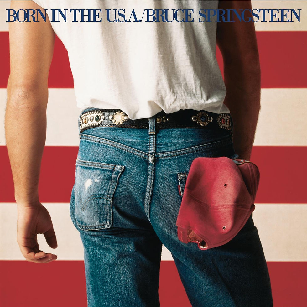
It’s fitting that Bruce’s massive stadium-sized breakthrough record also has an iconic cover design to go with it. The photo was taken by legendary rock and roll photographer Annie Leibovitz, who had a way of capturing her subjects in unusual ways. And I’ve said it before and I’ll say it again, nobody could photograph a guy’s ass like Annie could. Actually, that’s not really the case, they just took an ass-load of photos during the shoot and as Bruce once joked, “the picture of my ass looked better than the picture of my face, so that’s what went on the cover.” There’s some truth to it when you think about it. Would another photo of Bruce’s face on an album cover have had a similar visual impact? I’d argue no. Instead we get a cover that is as American as it gets. Levi's, white work t-shirt, and a red ballcap (no, it's NOT a bandana as some have claimed), with Bruce standing in front of the old stars and stripes (in this case, just the stripes). It’s America in more ways than one, even though the album itself isn’t, as Ronald Reagan might’ve thought, a celebration of American pride. Some also claimed he was pissing on the American flag. Just because he's facing it doesn't mean he's urinating on it. I would speculate that he's pondering its meaning and thinking about what it means to be from the U.S.A. in 1984, a year made famous in George Orwell's book of the same name. The album’s lyrics clearly support this way of thinking. Are we living up to our ideals or are we not? We should always be asking that question and striving for better (especially in 2020). So the answer is always going to be yes and no. And let's hope we're making progress somewhere.
On a design note, the font is surprisingly small and nonintrusive, which I assume was done so as to not interfere with a clear view of Bruce's tukkus. (This is also the only time a slash is used between the title of an album and Bruce’s name, for the record.) As to the hat in the back pocket, some have said people don’t put hats in their back pocket, and if they do, they don’t tuck it in bill first. I don’t think that’s the case, however. I personally remember shoving the bill in first because it would then expand and hold the hat in better when not in use. Otherwise the weight of the heavier bill would cause the hat to fall out. So I submit that this is not a common practice, but it is also acceptable. True, Bruce didn’t wear baseball caps very often, but in the end I think he was trying to make the picture as “apple pie America” as possible. And then he deconstructed that idealistic imagery with his songs. The only way the photo could be more American is if he was holding a gun in his left hand. One last point: through all the debate about this cover, one thing that has never been mentioned is my favorite part of the whole picture—the belt! Check out that fabulous belt! I wish he had sold replicas at the souvenir stand when I saw him on this tour. I would’ve bought one for sure. It takes the red, white, and blue motif and adds some much-needed pizzaz. He is Bruce Springsteen after all and this is his most popular album of all-time. I love when a great album has a great cover to go with it. One that is visually memorable but also includes a deeper message as well. Born in the U.S.A. has both. And a killer belt.
#04 Western Stars (2019)
Grade: A

Speaking of butts on album covers, here’s another one! And what a gorgeous, shiny, and muscular buttocks it is! This is as American as the Born in the U.S.A cover, but in a different way. After all, what is more classically American than a horse running free* in the wild, wild West? This is a cover you can put right over the fireplace in your living room and keep it there for generations. Every decision made on this album cover was sheer perfection, too. The photograph used, by Swedish photographer Kalle Gustafsson, stirs the soul. It expresses both power and beauty simultaneously. The framing, the vibrant colors, the blue skies, the barren landscape, the chocolate-brown horse dancing with joy, it's all a celebration of nature and freedom. This is a record to buy on vinyl if only for the beautiful cover. The lettering is perfect as well (for once). This is the first Bruce album not to include his name on the cover and it was the right decision—is that necessary at this point in his career? Let the photo do all the talking. This tells you everything you need to know about the sound and vision for the album. Initial versions did have his name in a smaller font below the title, but that was wisely eliminated in the end. I might’ve voted for just the horse—no title, no name—but the way Western Stars floats in the sky seems just the perfect compromise. Sometimes it's best just to let beauty speak for itself.
*The horse is wearing horseshoes, so not a totally free horse, but you get the idea.
#03 Darkness on the Edge of Town (1978)
Grade: A

Bruce’s vision for this album was locked down from the get-go. As Bruce fans know, he could’ve made it much more commercial by adding “Because the Night” and “Fire” to the track list, but he knew what he wanted to say and stuck to that vision at all costs. And the cover does the exact same thing. There is no album cover in Bruce’s long history that mirrors the feel of the music inside the sleeve quite like Darkness. Again, it features a Frank Stefanko photo (as previously covered in The River entry) and there’s nothing fancy about it, which is exactly what makes is perfect. The characters in Darkness’s songs are struggling to survive, desperate yet hopeful. These are stories about normal people living normal lives so shooting Bruce in a typical American home fits the overall mood of the record. He's simply dressed, naturally lit, with no real discernible expression. It's almost vacant even. The walls are smoke stained, the wallpaper flower-patterned, the mini-blinds functional not decorative. There's nothing fancy or new to be found. The typewriter font is as simple as it gets. This cover sets the tone for what you’re about to hear, which is what an album cover should do. If any album cover could be used to explain Bruce to someone, this is it.
#02 Greetings From Asbury Park, NJ (1973)
Grade: A

I have always loved this album's vintage cover. John Berg, a long-time member of Columbia’s art department, designed it and I’m still somewhat amazed it was accepted by the label’s top brass. Today, it would be a major stretch to not put a picture of a new artist on the cover of their debut album. So it took some serious balls to go this route. As a matter of fact, the only pictures of Bruce to be found anywhere on the album are a relatively small “postage stamp” photo on the inside flap of the postcard fold-out and a repeat of that very same image on the back cover. That’s it! So much for a big photography budget. Columbia was initially going to position Bruce as a New York artist, but he didn’t like that idea. Hence, he decided to stress his Jersey origins instead, and not in a small way. He changed the album’s title to make that point abundantly clear. So Berg did what any respectable graphic artist should do. He focused on what the artist was all about and ignored the label’s marketing angle. In the process, he came up with a striking cover concept that reflects the boardwalk culture of Asbury Park beautifully. He chose to adapt a classic tourist postcard that visitors might buy while walking the boardwalk during their summer vacation. Using a timeless postcard format was a touch of brilliance and the colors are vibrant and appealing (a couple short of a Pride flag!) and the images bring to life the glory days of the town even though they are long in the rear view mirror. It is nothing short of a piece of art. I’m equally impressed that the design of the record allowed for the postcard to stand on its own and fold out so you can read the back side like you would an actual postcard (instead of a note, you’ll find the band credits—complete with Clarence’s last name spelled incorrectly!). I have to imagine the budget for such a production had to be more than the normal album configuration so good for Columbia for allowing it. On top of that, the label knew they had a great lyricist on their hands and put all the lyrics right inside the postcard flap for easy access. Nice idea! The rest of the front cover is black with Bruce’s name in a very attractive script. The black only makes the postcard pop all the more. I sometimes pick this album to play just because I want to stare at the cover art for a while. It makes me want to write someone a note and stroll down to the mailbox to send it out.
#01 Born to Run (1975)
Grade: A+

What more can be said really? One of rock’s greatest albums deserves a cover worthy of its contents and Born to Run manages, with one perfectly chosen photo, to do just that. Every Springsteen fan knows that Eric Meola was the photographer of this legendary picture. He had numerous other options to pick from, including Bruce’s choice which was much more serious in tone than the eventual smiling Bruce that now graces the cover, but Eric was drawn to this one. It seemed to capture the true bond, love even, between two band mates. Bruce leaning on his close friend Clarence's back with a smile on his face. The joy of making music with a great band cannot be understated. It wasn't a given that this shot would be used, but guess who was responsible for making the final recommendation to use it? None other than our friend John Berg, the designer of the cover for Greetings! If there is one relatively unknown but important figure in the history of Bruce’s collective album art it is Berg, who seemed to have a masterful eye for design as well as an intuitive ability to know what would work best in just about any situation. The key to Born to Run's cover is the

gatefold sleeve. Bruce and his guitar on the front side, but enough Clarence visible for the viewer to immediately want to see the rest of the photo. The album opens and the entire picture emerges. It’s the only time Clarence also made the cover of one of Bruce’s albums and their friendship and spirit oozes from the shot. If I had never heard of Bruce, I'd still want to know what this record sounds like based on the cover alone. Another wise choice by Berg was to change the font to something more readable and crisp. The original (pictured) featured an unappealing, jagged script that just doesn't look right. It’s so much better this way. There’s action, there’s information, and there’s plenty of white space. It's a visual that has stood the test of time and always ranks with the greatest album covers of all-time. And it was born to be the runaway choice for best Bruce Springsteen album cover ever.
POSTSCRIPT
Before we go, here's a quick run-through of some selected Bruce covers that weren’t studio albums. Compilations, live albums, etc.
Live 1975-85 (A)

A great image of Bruce in front of the footlights where he feels most at home. Love how it’s just him and his guitar, foot in air as if he’s about to end a song.
In Concert/MTV Unplugged (F)

Everything from the Lucky Town/Human Touch era is terrible and there’s no excuse for this shitty baseball card of a cover to ever have been released. Just product, plain and simple.
Greatest Hits (A)

Great shot from the Born to Run photo shoot with Eric Meola. Would’ve been a fine cover for Born to Run, too. It deserved to find its way onto the cover of something.
Tracks (C-)

Nothing special about this one, except they airbrushed out a beer on the end table (not shown here since it was a longbow and it cut off) and a cigarette between his fingers to make it more palatable which is absolutely unforgivable, not to mention ridiculous. Seems like a lot of effort for a guy who has been photographed a few billion times in his life. How about just finding another photo?
Live in NYC (D+)

A messy attempt at a concert poster courtesy the inept Columbia art department.
The Essential Bruce Springsteen (C-)

Why this blurry photo? Clearly, nobody really cared about the “Essential” series at Columbia, at least from an album design standpoint. Looks like they did this one on the cheap.
Hammersmith Odeon, London 1975 (C)

Uninspired action shot from the legendary concert. If you want really good Bruce live action shots, pick just about any of his live albums from his web store. Uniformly attractive and well chosen.
Live in Dublin (D+)

The same shitty art department from the 2000s proves there was no change in approach for Bruce’s live albums either. It blends in with his other records and it's ultimately forgettable.
The Promise (B)

A little bit Nebraska, a little bit Darkness. If this was an official studio album it would rank in the upper half of the list above, which isn’t that big of an accomplishment really.
Springsteen on Broadway (B)

A little bit better than other live albums released, but nothing memorable or striking. Pretty much the same concept as Live in Dublin, but etched in ice, which is predictably much cooler. I kinda like it the more I look at it.
Cheers,
The Priest